Role
UX Designer
Duration
Expanding Framework
Company
Open Network Exchange
Tools
Figma
Job Summary
Centralize membership benefits, wallets, and certificates into a flexible component system built to support evolving partner ecosystems and tier structures.
Overview
I redesigned an existing account page for a membership-based marketplace platform that partners with hotels, resorts, cruises, wine sellers, live experiences, and merchandise providers. The platform acts as a value-add layer to purchases users are already making, giving members access to discounts, certificates, and perks across multiple verticals.
As the company expanded across brands, partner types, and membership models, the original account experience no longer reflected the complexity or scale of the ecosystem.
Goal
My goal was to modernize the account page into a scalable, modular system that could support evolving business needs, improve clarity for members, and meet technical feasibility requirements for the development team.
Challenge
The existing account page was originally designed for a smaller ecosystem and became increasingly difficult to scale as the platform evolved.
Primary Frictions
Original account experience was not designed to scale across expanding brands, tiers, and verticals.
Membership value and perks lacked visibility, making benefits difficult for users to understand.
Certificates were buried within the wallet flow, reducing discoverability and engagement.
Repetitive certificate modules required manual handling for every vertical and use case.
Redemption states (available, redeemed, expired) lacked a consistent, unified system.
Multiple partner ecosystems, currencies, and business models required a flexible, scalable framework.
Approach
I approached the redesign by creating a modular component system centered around scalability, adaptability, and clarity.
1.
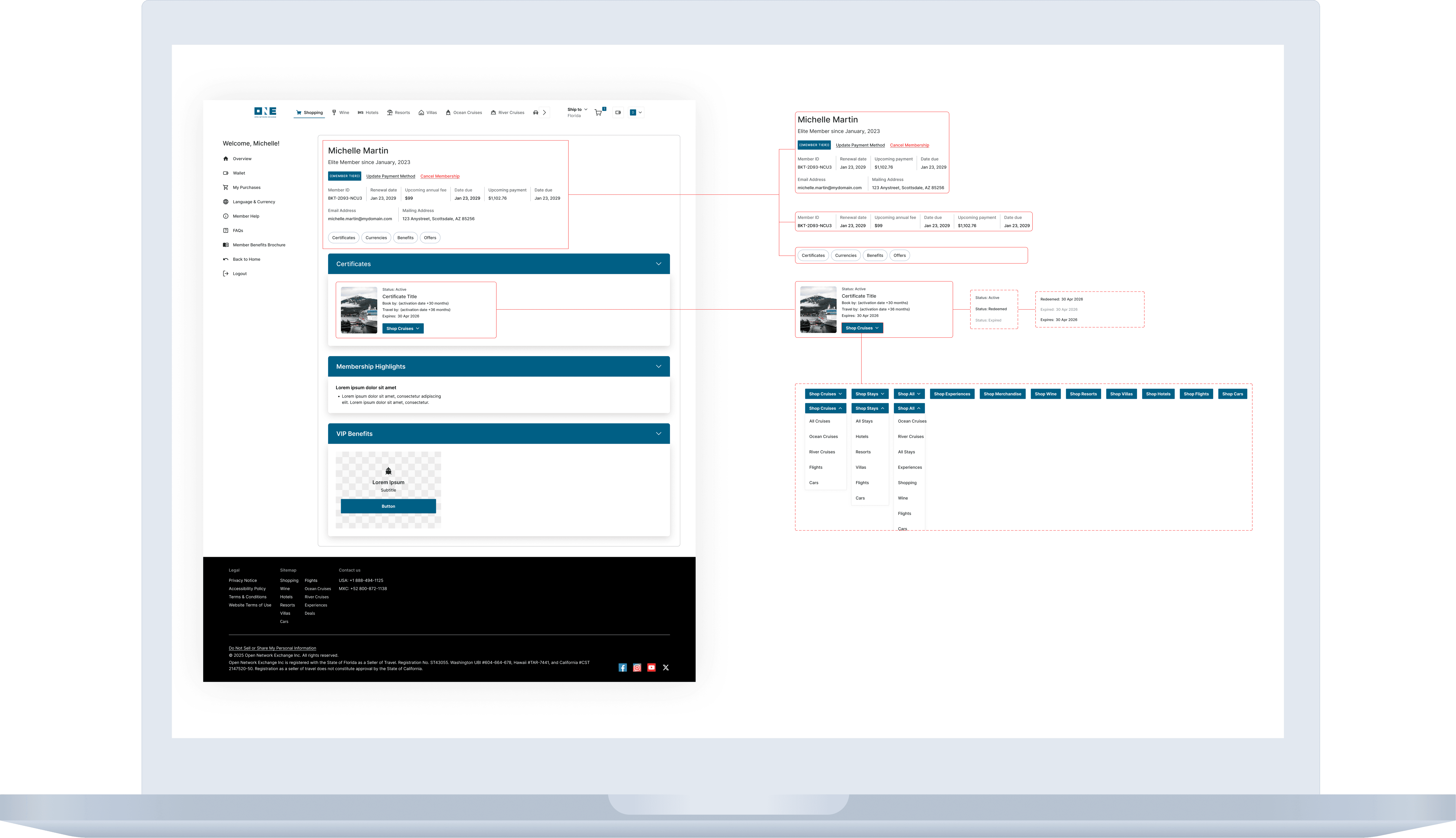
Consolidated the Account Experience
I restructured the account page to become a centralized destination for:
Membership summaries
Tier benefits
Wallet balances
Certificates
Instead of distributing information across multiple tabs, the new experience surfaced the most valuable information immediately within the account overview.
2.
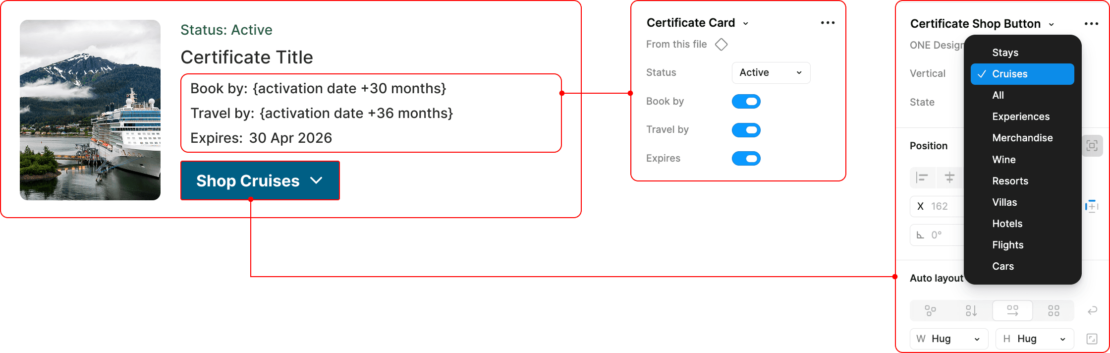
Designed a scalable certificate system
The original design required repeated UI patterns for every certificate type and vertical. I replaced this with a single flexible component capable of scaling across current and future verticals:

Using configurable states and toggles, the same component could adapt dynamically based on:
Brand
Membership tier
Currency type
Redemption state
Vertical category
3.
Introduced Tier & Benefits visibility
The previous account page did not communicate membership value clearly. I introduced a benefits summary layer that surfaced:
Membership tier
Eligible perks
Available credits/currency
Relevant rewards tied to each partner program
Because each brand had unique tier structures and currencies, the system was intentionally designed to remain brand agnostic while still accommodating partner-specific logic.
4.
Added clear redemption states
I redesigned certificate visibility by introducing standardized states:
Available
Redeemed
Expired
This improved transparency for users and reduced ambiguity around benefit usage.
Outcome
The redesigned account experience created a more scalable and future-ready foundation for the platform.
A unified account experience that better communicated membership value
Improved discoverability of certificates and perks
A reusable component system capable of supporting unlimited verticals
Reduced UI redundancy through configurable states
Clearer redemption visibility for users
A brand-agnostic structure adaptable to multiple partner ecosystems and membership models
Most importantly, the redesign transformed the account page from a fragmented utility page into a centralized membership hub that could evolve alongside the company’s expanding partner network.